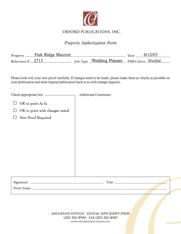
BACK to Corporate Identity
 
CreativLee Designed LLC © 2009 All Rights Reserved.  | Privacy Policy IDEA: An established publisher was stuck in the past with an outdated logo, difficult to maneuver forms and business cards that screamed, “unprogressive.” 

We determined that the client wanted streamlined branding to express the parallels of innovative changes that were transforming their company. In order to show the strength of their experience a timeless design was developed with classic colors, two rich cream tones and a simple stylish “O” within a deep red box. A hint of the “O” logo was then repeated as a large watermark at the far bottom corner of their materials. Their forms were given a much needed update with modern fonts, well organized information, and clearly numbered boxes for employees and clients to easily fill out.


PROJECT: Corporate Design
CLIENT: Oxford Publications, Inc.
 
• Logo Design • Business Card • Brochures
• Letterhead & Envelope • Company Manual • Form Re-design